Infographic design and pinpointing the target audience, engagement, define goals and objectives, choosing a relevant topic, visualizing the data, and sketching a wireframe has emerged as pivotal tools in the realm of visual storytelling. Transforming intricate data into accessible and engaging narratives. The essence of infographics lies in their ability to distill complex information into a format that is not only comprehensible but also visually appealing. By leveraging a combination of graphics, text, and data, infographics simplify the process of understanding multifaceted concepts, making them an invaluable asset for both educational and marketing purposes.
At its core, an infographic is designed to convey information efficiently and effectively. This visual medium capitalizes on the human brain’s innate preference for visual input.
Therefore enabling viewers to grasp and retain information more quickly than they might through text alone. The versatility of infographics allows for their application across a wide spectrum of fields. In educational settings, they can break down complex theories and data sets into digestible segments, facilitating better comprehension. In marketing, infographics serve as powerful tools to communicate brand stories, product features, and market analysis, often resulting in higher engagement rates compared to traditional text-based content.
Moreover, the appeal of infographics extends beyond their aesthetic value. They cater to a diverse audience by transcending language barriers and providing a universal method of communication. This inclusivity makes infographics a potent medium for conveying information to a global audience, enhancing both accessibility and impact.
In summary, infographic design is not merely about making data look attractive; it is about making information more accessible, understandable, and engaging. By harnessing the power of visual storytelling, infographics transform complex data into clear, compelling narratives that resonate with a wide audience, bridging the gap between data and understanding.
Pinpointing the Target Audience
Understanding and pinpointing the target audience is a crucial step in creating effective infographics. Identifying and analyzing your audience allows you to tailor your design and content to their preferences, needs, and behaviors, ultimately enhancing engagement and effectiveness.
To begin, consider demographic factors such as age, gender, education level, and occupation. These elements provide a foundational understanding of who your audience is. For instance, an infographic aimed at professionals in the tech industry might employ more technical language and complex data visualizations, whereas one designed for a general audience should focus on simplicity and clarity.
Next, delve into psychographics, which include interests, values, and lifestyle choices.
This deeper level of analysis helps in crafting content that resonates on a more personal level. For example, an infographic about sustainable living should appeal to environmentally conscious individuals by highlighting eco-friendly practices and statistics.
Behavioral data is another key aspect to consider. This includes how your audience interacts with content online. Are they more likely to engage with visual content over text-heavy formats? Do they prefer infographics that tell a story or those that present raw data? Understanding these behaviors can guide your design choices, from the layout and color scheme to the type of charts and graphics used.
Engagement
Once you have a comprehensive profile of your target audience, you can tailor your infographic to meet their specific needs and preferences. This customization can significantly increase the infographic’s effectiveness and engagement. For example, using relatable imagery, appropriate jargon, and relevant data can make the content more compelling and easier to digest for the intended audience.
In conclusion, pinpointing your target audience is not just about knowing who they are but understanding what drives them. This insight is pivotal in designing infographics that not only capture attention but also convey information in a meaningful and impactful way.
Define Goals and Objectives
Before diving into the intricate process of infographic design, it’s imperative to establish and define goals and objectives. These guidelines will act as the cornerstone for your design, ensuring that every element aligns with your overarching vision. Implementing SMART goals—specific, measurable, achievable, relevant, and time-bound—will be instrumental in this endeavor.
To begin with, delineate specific goals. What exactly do you want your infographic to convey? Whether it’s to educate your audience about climate change, illustrate a business process, or showcase statistical data, specificity will help streamline your efforts and keep your project focused. Measurable goals are equally critical; they provide a metric against which you can gauge the success of your infographic.
For instance, aiming for a certain number of shares or likes on social media can be a measurable objective. Achievability is another important factor. While it’s tempting to set high aspirations, your goals should be realistic given your resources and timeframe. Assess your capabilities and ensure that your goals are attainable. Relevance ties directly into the purpose of your infographic. Ask yourself: Does this goal align with the overall objectives of my project or business? Ensuring relevance not only keeps your design on track but also enhances its impact.
Lastly, time-bound goals provide a deadline, thereby instilling a sense of urgency and importance. Setting a specific timeframe for each phase of the infographic design process, from initial brainstorming to final tweaks, will keep the project moving efficiently.
In summary, establishing SMART goals at the outset will serve as a roadmap, guiding every aspect of the design process. These clearly defined objectives will help ensure that your final infographic not only meets but exceeds your expectations, delivering a product that is both visually appealing and purpose-driven.
Choosing a Relevant Topic
One of the fundamental steps in creating a compelling infographic is choosing a relevant topic. A topic that resonates with your audience and aligns with your goals can significantly enhance the effectiveness of your infographic design. To begin, consider the current trends within your industry. Staying updated with what’s trending can provide you with a plethora of ideas that are not only engaging but also timely. Leveraging these trends can make your infographic more relatable and shareable.
Audience interests should be at the forefront of your decision-making process. Understanding your audience’s preferences, pain points, and areas of interest is crucial. Conducting surveys, analyzing social media interactions, and reviewing feedback can offer valuable insights into what your audience is looking for.

This data can guide you in selecting a topic that not only captures attention but also provides value. Another critical factor is the message you want to convey. Your topic should align with the core message or goal of your infographic. Whether you aim to educate, inform, or persuade, your topic should be clear and concise, avoiding any ambiguity. It should also be specific enough to provide depth yet broad enough to appeal to a wide audience.
Additionally, consider the scope of your topic. An overly broad topic can dilute the impact of your infographic, while a highly niche topic might not attract a large audience. Striking a balance between specificity and broad appeal can enhance the relevance and engagement of your infographic.
In summary, choosing a relevant topic involves a careful blend of understanding current trends, audience interests, and the intended message. By thoughtfully selecting a topic that encompasses these elements, you set a strong foundation for crafting an infographic that is both engaging and effective.
Collecting and Fact Checking Data

Accurate and credible data is paramount for creating compelling and trustworthy infographics. The first step in this process is gathering reliable data from reputable sources, collecting and fact checking data. Reliable sources include academic journals, government publications, and well-known industry reports. Websites ending in .edu, .gov, and .org are often more credible than commercial sites. Additionally, databases like PubMed, Google Scholar, and JSTOR can provide access to peer-reviewed articles and studies that add depth and legitimacy to your infographic.
Once data has been collected, the next crucial step is fact-checking. Fact-checking involves verifying the accuracy of the information by cross-referencing multiple sources. This practice helps identify any discrepancies or outdated information. Tools like FactCheck.org, Snopes, and Google Fact Check Explorer can assist in validating claims and statistics.
It’s also advisable to consult experts in the field to ensure the data’s accuracy and context. Proper citation of sources is essential to maintain credibility and transparency. Always attribute data to its original source, using proper citation formats such as APA, MLA, or Chicago Style. Citations not only strengthen your credibility but also allow readers to trace the information back to its origin, facilitating further research. In an infographic, citations should be clearly visible, either within the graphic elements or as a separate reference list at the end.
Moreover, ethical considerations should guide the data collection and fact-checking process. Avoid cherry-picking data that only supports your narrative, and strive for a balanced representation of information. Transparency in data sourcing and citation fosters trust and enhances the overall impact of your infographic.
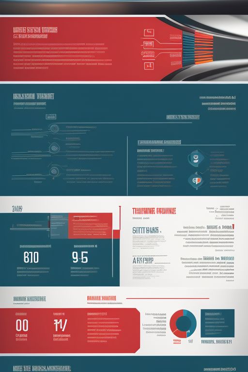
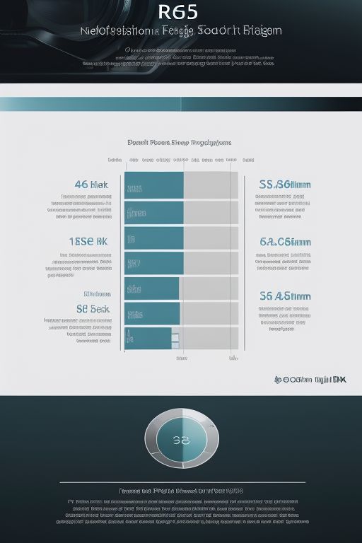
Visualizing the Data
Choosing the right visual elements to represent your data is crucial for clarity and engagement. Effectively visualizing the data transforms complex information into accessible and visually appealing content. Various techniques, such as charts, graphs, icons, and illustrations, can be employed to enhance the viewer’s understanding and retention of the information presented.
Charts and graphs are fundamental tools in infographic design. Bar charts and line graphs are ideal for displaying trends over time, while pie charts and donut charts are effective for illustrating proportional relationships. Scatter plots and bubble charts can provide insights into correlations between variables. Selecting the appropriate type of chart or graph depends on the nature of the data and the specific message you wish to convey.
Icons and illustrations add a layer of visual interest and can simplify complex concepts. Icons can be used to represent categories, actions, or objects, making the information more intuitive. Illustrations, on the other hand, can tell a story or provide context that text alone cannot achieve. When used strategically, these elements can draw attention to key points and make the infographic more engaging.
Customizing the visual hierarchy is essential to guide the viewer’s attention to the most important information. This involves adjusting the size, color, and placement of various elements. Larger and more vibrant elements naturally draw the eye first, so they should be used for the most critical data points. Consistent use of color schemes and typography also helps to create a cohesive look and feel, enhancing readability and overall aesthetic appeal.
Incorporating these visualization techniques thoughtfully can significantly improve the effectiveness of your infographic. By carefully selecting and customizing visual elements, you can ensure that your data is both informative and engaging, making it easier for viewers to understand and remember the information presented.
Setting the Tone and Writing the Copy

Setting the tone and writing the copy for textual content of your infographic are pivotal in determining its overall impact. Establishing an appropriate tone that corresponds with your message and audience is a fundamental step in infographic design. Whether your topic requires a formal, informative tone or a more casual, engaging approach, consistency is key. Understanding your audience’s preferences and expectations can guide you in selecting the right tone. For instance, a data-driven infographic targeting professionals would necessitate a more formal tone, while an infographic for a younger, tech-savvy audience might benefit from a conversational style.
Writing concise and compelling copy is another crucial aspect. Infographics are inherently visual; hence, the text should complement rather than overshadow the graphics.
Prioritize clarity and brevity in your writing. Every word should add value and aid in conveying the main message. Use active voice and strong verbs to make your copy more engaging. Bullet points, short sentences, and impactful phrases can effectively communicate complex information without overwhelming the reader.
Creating a textual outline is an effective strategy to organize your content. Begin by identifying the core message you wish to convey. Break this down into key points and subpoints, ensuring a logical flow of information. This outline serves as a roadmap, guiding the structure of your infographic. Each section of your outline should correspond with a visual element, ensuring a cohesive integration of text and graphics. This approach not only enhances readability but also ensures that the information is presented in a structured and digestible manner.
Incorporating these principles can significantly enhance the effectiveness of your infographic. By setting the right tone and writing concise, compelling copy, you ensure that your message resonates with your audience. A well-organized textual outline further strengthens the overall impact, making your infographic a powerful tool for communication.
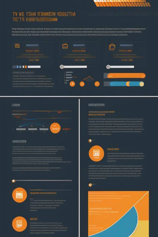
Sketching a Wireframe
Before diving into the final stages of infographic design, sketching a wireframe is an essential step that can significantly enhance the clarity and effectiveness of your final product. Wireframing involves creating a basic, low-fidelity outline of your infographic, which helps in planning the layout and organizing the structure. This preliminary sketch serves as a blueprint, ensuring that all elements are logically positioned and that there is a harmonious balance between text and visuals.
The primary benefit of wireframing lies in its ability to allow designers to visualize the entire infographic before committing to specific design elements. This foresight helps in identifying potential issues early on, such as overcrowded sections or elements that may distract from the main message.

By addressing these challenges at the wireframe stage, you can save considerable time and effort later in the design process. To create an effective wireframe, start by identifying the key points you want to convey and the visual elements that will support these points. Sketch out sections for the title, subtitles, and main content areas, ensuring that each section flows logically from one to the next. Use placeholders for images, icons, and data visualizations, and pay attention to the spacing between elements to avoid clutter.
Wireframe
It’s important to keep the wireframe simple and flexible. Avoid getting bogged down in details; instead, focus on the overall structure and flow. This approach allows for easier adjustments and refinements as you move forward. Additionally, consider the hierarchy of information, ensuring that the most critical data stands out and guides the viewer through the infographic seamlessly.
Incorporating feedback during the wireframe stage can also be invaluable to infographic design. Sharing your wireframe with colleagues or stakeholders can provide fresh perspectives. Therefore highlight areas for improvement that you might have overlooked. Ultimately, a well-planned wireframe sets a strong foundation for an engaging and effective infographic, making the subsequent design phases smoother and more efficient. Learn more in our Web Design Okc Blog

In Conclusion
- Explore the transformative power of infographic design in visual storytelling.
2. Learn how to create engaging and accessible narratives by distilling complex data into visually appealing formats.
3. Discover the importance of understanding your target audience.
4. Setting clear goals.
5. Choosing relevant topics, and ensuring data accuracy to craft compelling infographic Design that resonate across educational and marketing contexts.
6. The strategic use of colors, shapes, and icons can highlight key data points, trends, and correlations, providing a clear and concise representation of the subject matter.